
BBH REBRAND
Client ︎︎︎ BBH
Role ︎︎︎ motion design & direction, editing
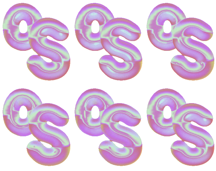
BBH's first rebrand in 44 years set out to bring the mantra of "When the world zigs, zag" into a modern visual system. Developed in collaboration with Studio DRAMA, the identity combines three bespoke open-source typefaces - each named after one of the agency's founders - alongside a tactile suite of 3D zag assets and a distinctive motion language. The aim was to celebrate BBH's heritage while bringing the brand into the modern world. The result is a flexible global brand system designed to work across every touchpoint.
As Motion Design Director, I led the development of the motion language across the new identity, bringing the custom type system to life through a set of motion principles inspired by the idea of "zagging". Fluid typography sits alongside unexpected movements, weight morphs, and flash-frame transitions to create a system that feels both dynamic and recognisably BBH. The motion language lives across brand reels, presentations, office screens & social content.
Motion language
Working with a type-led system in black and white doesn't leave much room to hide, so every movement was intentional. The motion ranges from fluid typographic animation to unexpected, zag-inspired gestures, using weight morphs and custom glyphs to highlight key moments. Fast inverted flash frames punctuate transitions with moments of surprise. A target frame rate of 50fps was set for smooth motion, while still considering GIF limitations in decks and presentations. Motion curves were pushed to extreme easy ease to add punch, surprise, and energy across the work.


Alternate type
True to BBH’s philosophy,“When the world zigs, zag” the Hegarty typeface features alternate characters with distinct unexpected shapes, angularity and fluidity. The morphing animation was done by hand, with a manual labour of love of animating every point and every Bézier curve.


Early exploration
During the early stages of the project, we explored incorporating a small rectangular shape into the identity, alongside a broader colour palette that included black, grey, and orange. These early investigations helped inform the direction of the final system, which ultimately evolved into a more focused black-and-white identity.
![]()
![]()
![]()
![]()
![]()
![]()
![]()
Out in the world
To further cement the BBH Zag philosophy, the font is now free for everyone to use from Google fonts
![]()
![]()


