CHATSWORTH BAKEHOUSE
BRAND IDENTITY
Client ︎︎︎ Chatsworth bakehouse
Role ︎︎︎ brand idenitity, illustartion, merch design
Chatsworth Bakehouse is a micro-bakery at the heart of Crystal Palace in South London. Born out of the Covid crisis, what began as a community kitchen run from the founders’ flat - where baked goods were shared in exchange for donations - has grown into one of London’s most loved independent bakeries, still with community at its core.
Founders Sian and Tom wanted a brand that reflected their values: fiercely independent, community-led, and fuelled by a genuine love of baked goods and the joy they bring.
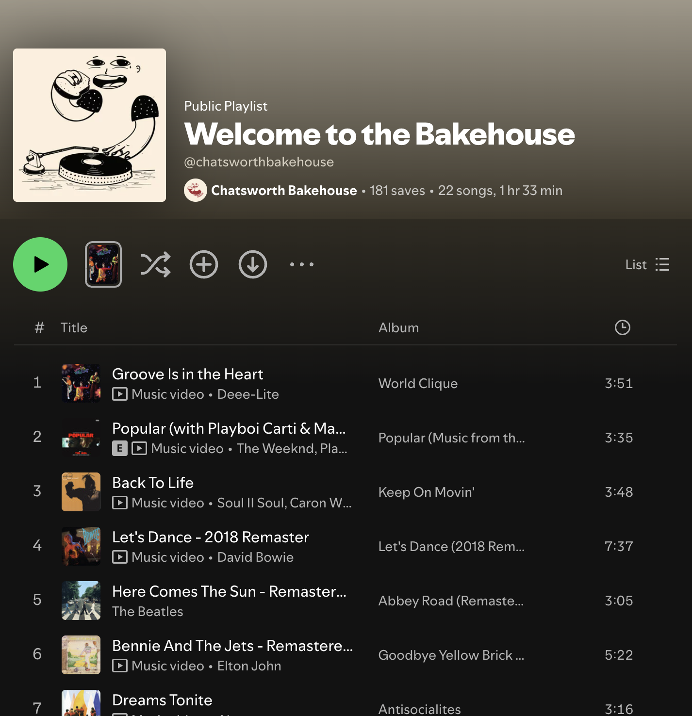
This is an ongoing collaboration, and the Chatsworth world keeps expanding with new merch, illustrations and moments. The bakery has been featured across online publications, TikTok and Instagram, and was voted one of the 15 best bakeries in London by The Telegraph,and BBC good foods. A testament to how a baked dream that started in a small flat kitchen became a much-loved local institution and I couldn’t be happier to be part of the journey.
Overview
When creating the brand, I set up core design pillars to ground the visual language in what Sian and Tom value most. It needed to feel joyeful, authentic, tactile, handmade, embracing the uniqueness you get in every individually crafted sandwich, cookie or pie.
Brand world
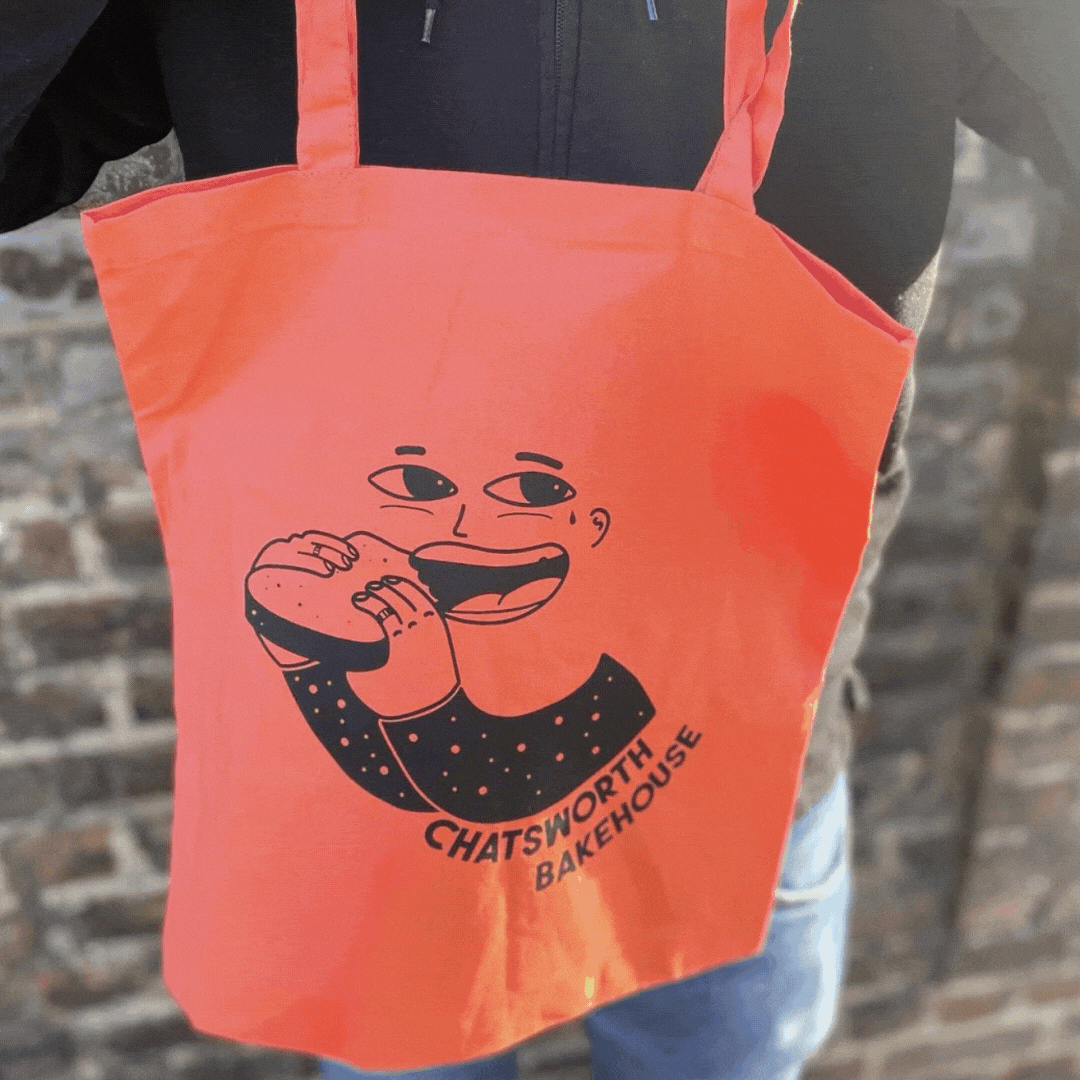
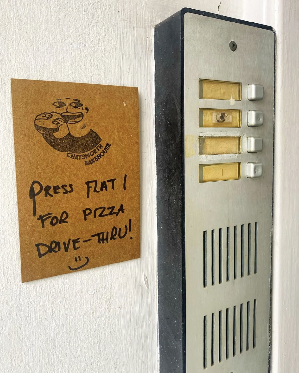
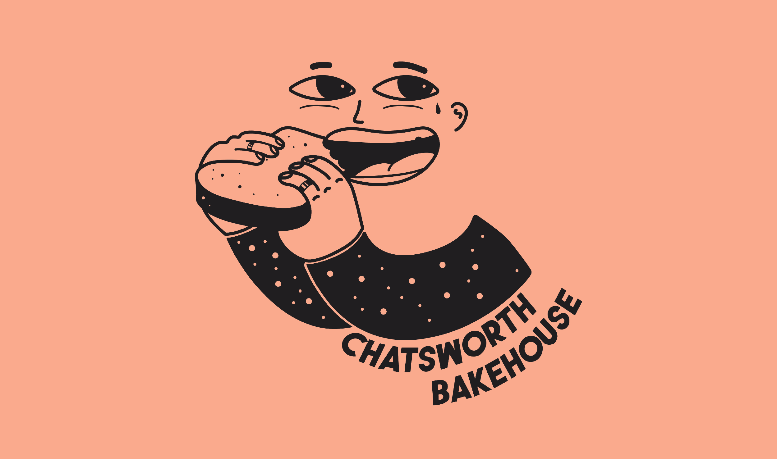
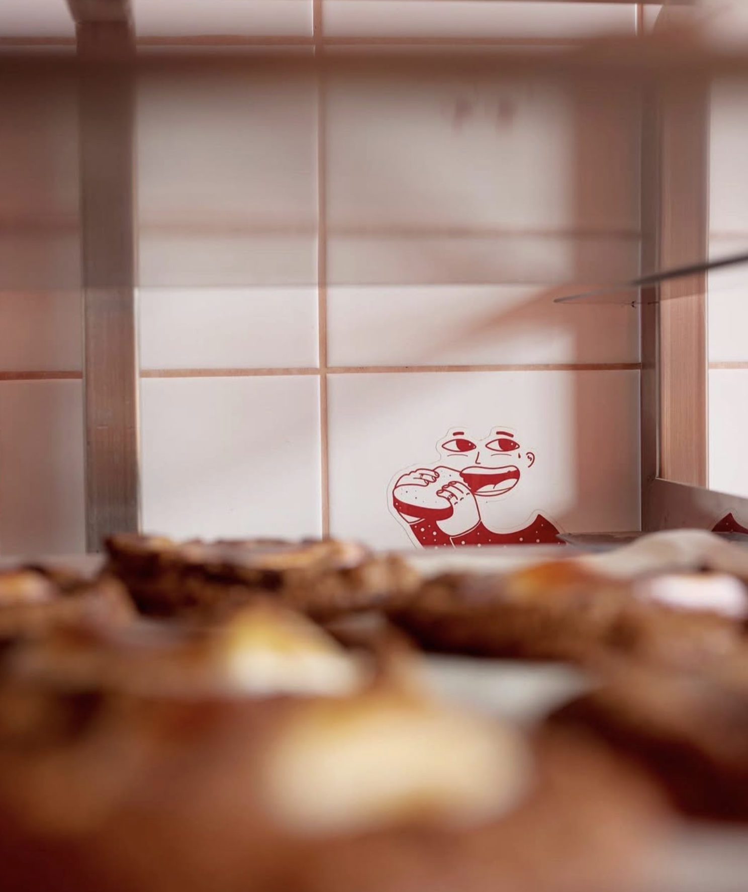
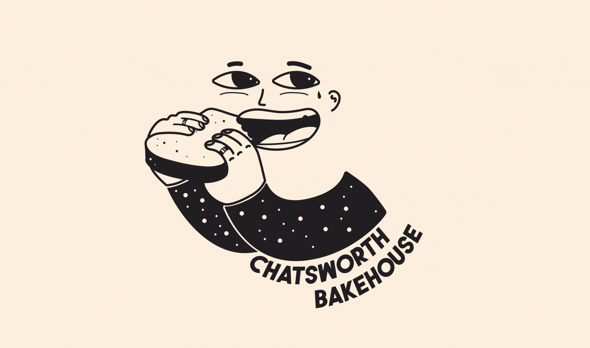
From early on, we knew an illustrated mascot was the right direction — simple, playful and a little cheeky. Mascots have this brilliant way of giving a brand an immediate personality; they invite people in before a single word is read. For a bakery built on community and character, it felt like the perfect fit.
Mascots also hold emotion, humour and humanity in a way few design elements can. They create instant recognition, help brands stand out in crowded categories, and bring a flexibility that grows as the brand grows. For Chatsworth, the mascot became the anchor of the visual world - warm, handmade and unmistakably “them.”
They’re cool, a bit messy, and absolutely not afraid to dive straight into that bread.
Is that a teardrop tattoo? A tear of joy? Who’s to say.
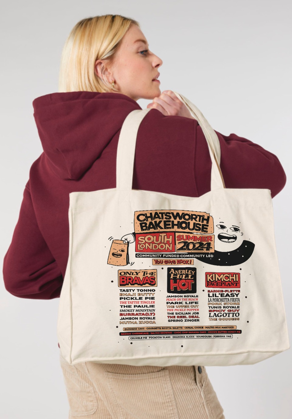
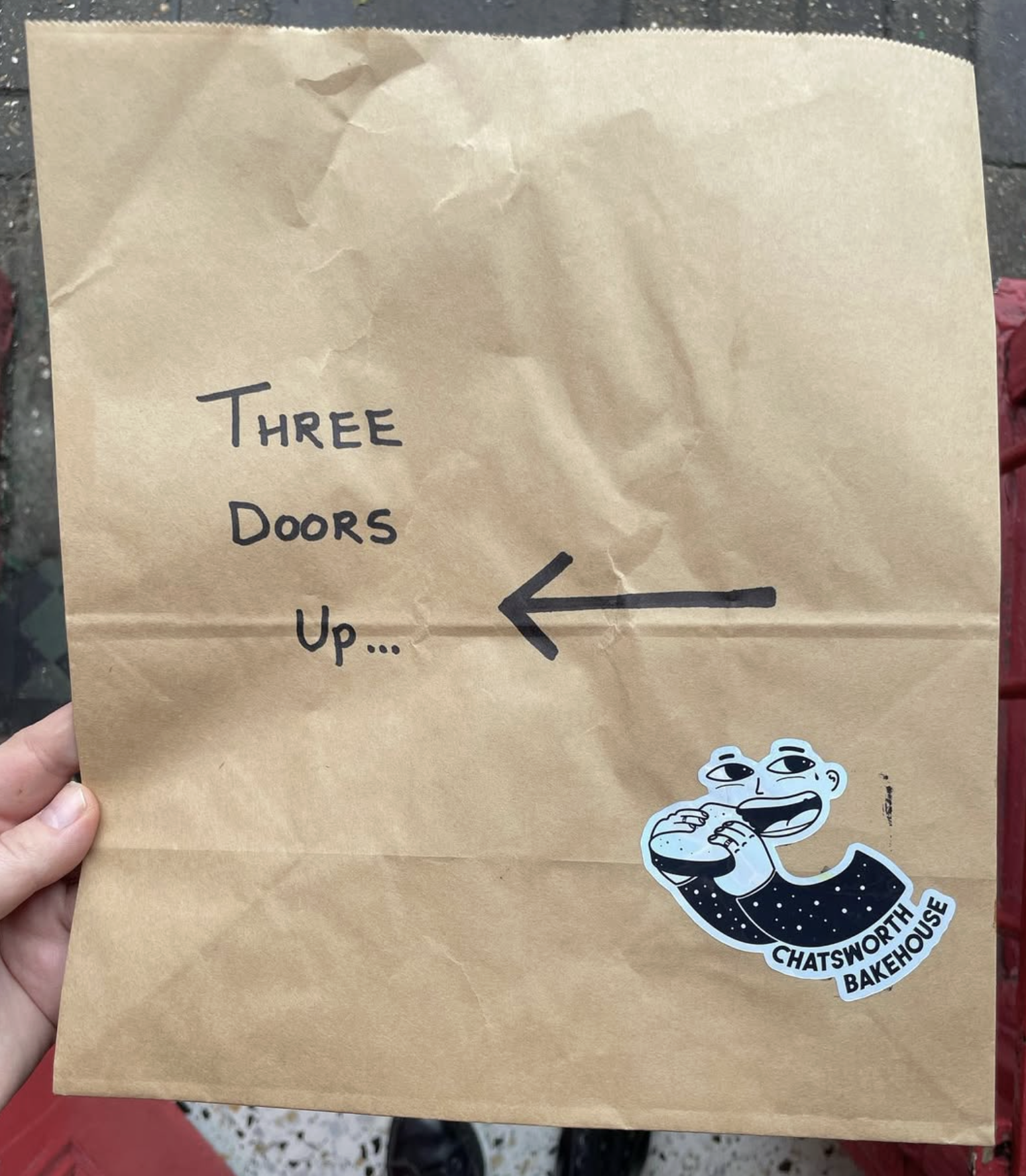
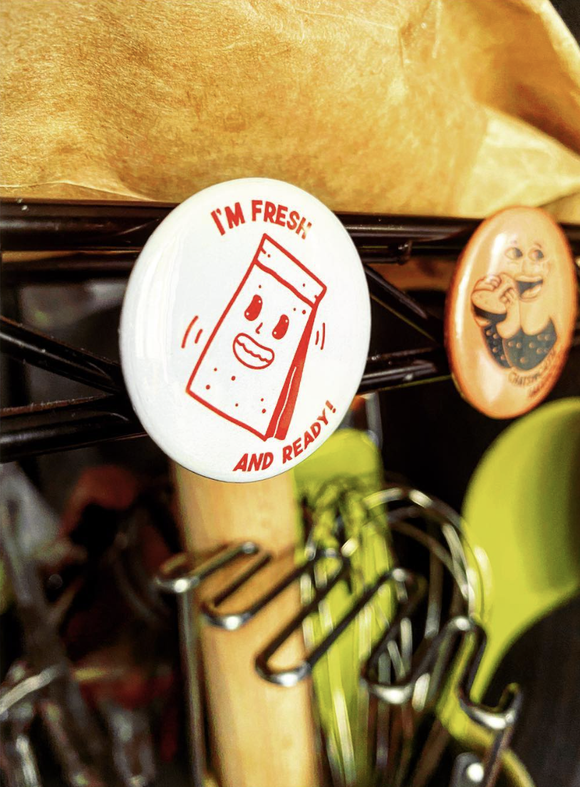
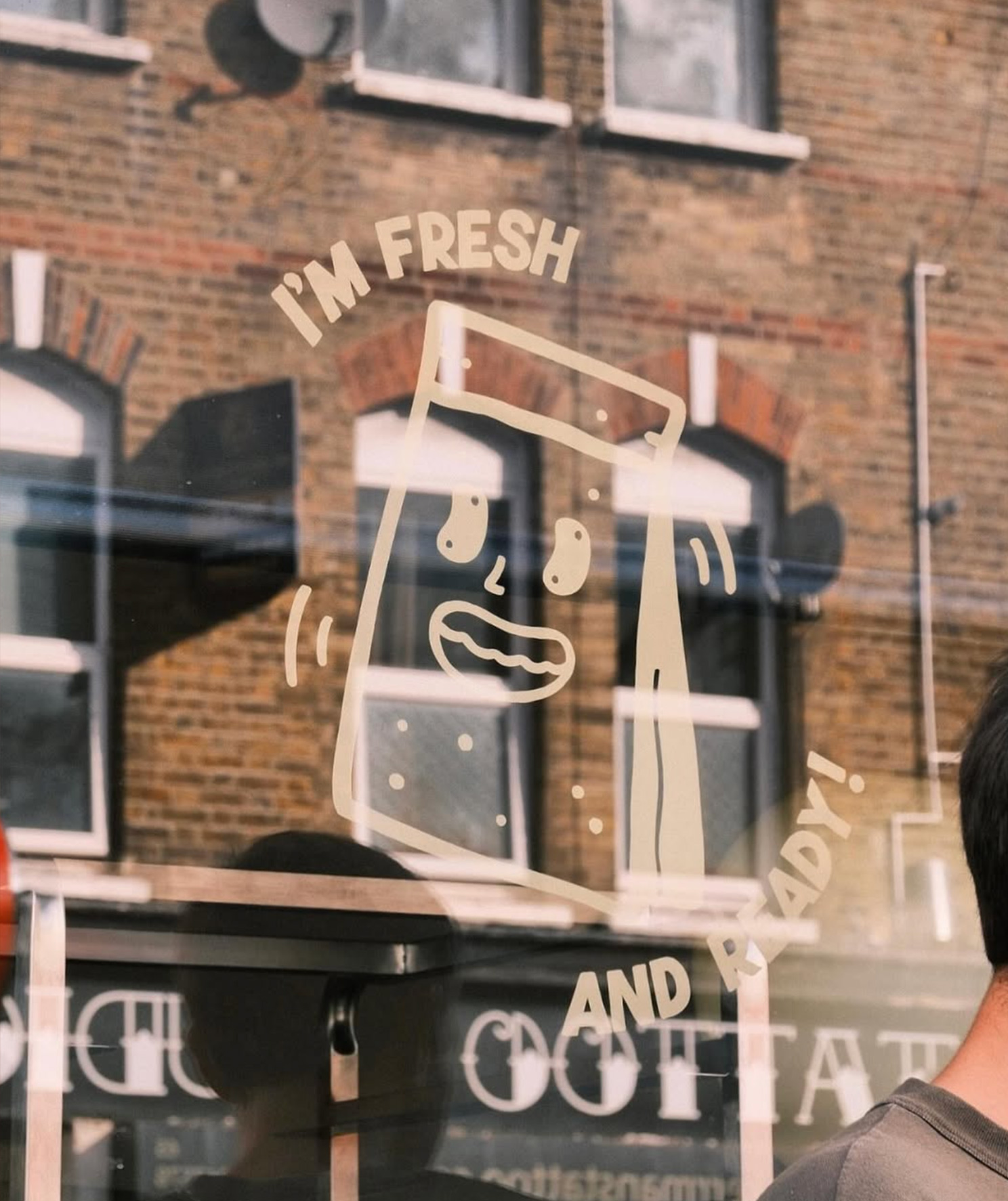
Alongside the main mascot, I created supporting illustrations and alternate scenarios for special events - building a flexible and characterful brand world.
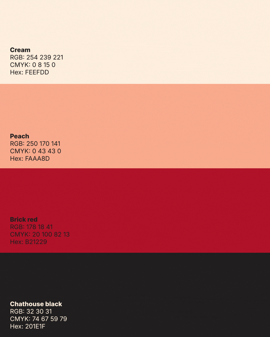
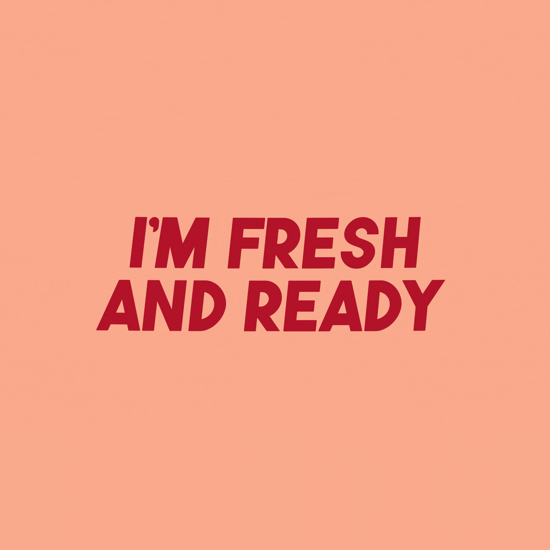
The colour palette is warm and inviting—peach, cream and brick red supported by a soft, warm black. They’re colours you naturally associate with good food: soft creams, toasted tones, warm reds. It keeps the brand friendly and appetising without feeling literal, and it pairs nicely with the mascot’s character.


Typography
The type needed to feel warm and friendly. Starting with the Genuine font (by Newari Studio), and staying true to the idea that “no two breads are the same” - I tweaked individual letters, stretching and squashing where it felt right. The result is a type treatment that’s fun imperfect in all the best ways, and full of that handmade energy you get from a real bakery.


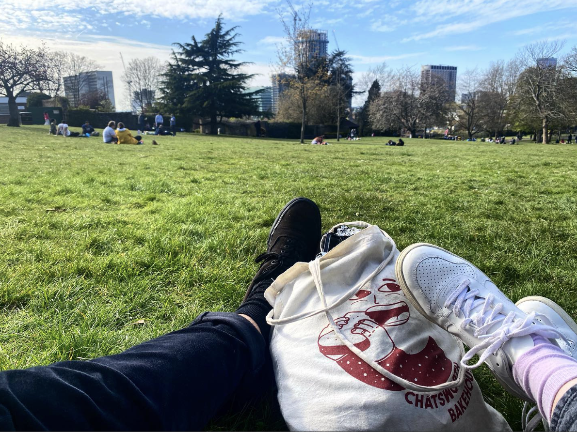
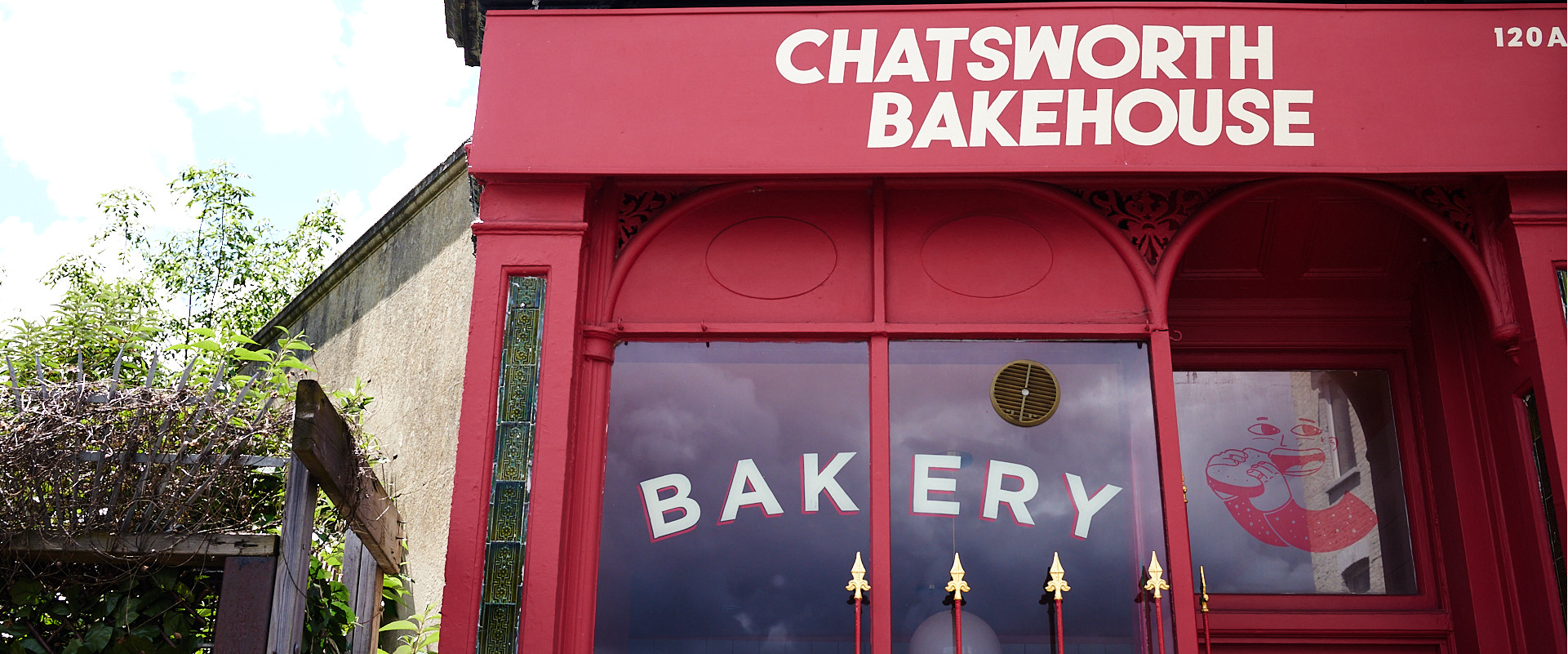
Most of the brand lives out in the real world - tote bags, stickers, stamps and the shopfront, reinforcing its tactile, community-first identity.